

Using Tailwind CSS
Learn how to style Clerk components using Tailwind CSS
Overview
Tailwind CSS is a utility-first CSS framework that is used to apply styles directly in your markup. Clerk components support Tailwind classes for customization out of the box with the elements config of the appearance prop.
Usage
To use Tailwind to style Clerk components, you first need to identify the elements you'd like to style.
Open the development tools inspector and find the element inside the Clerk components you want to apply styles to. For example, the primary button on the Sign In form:
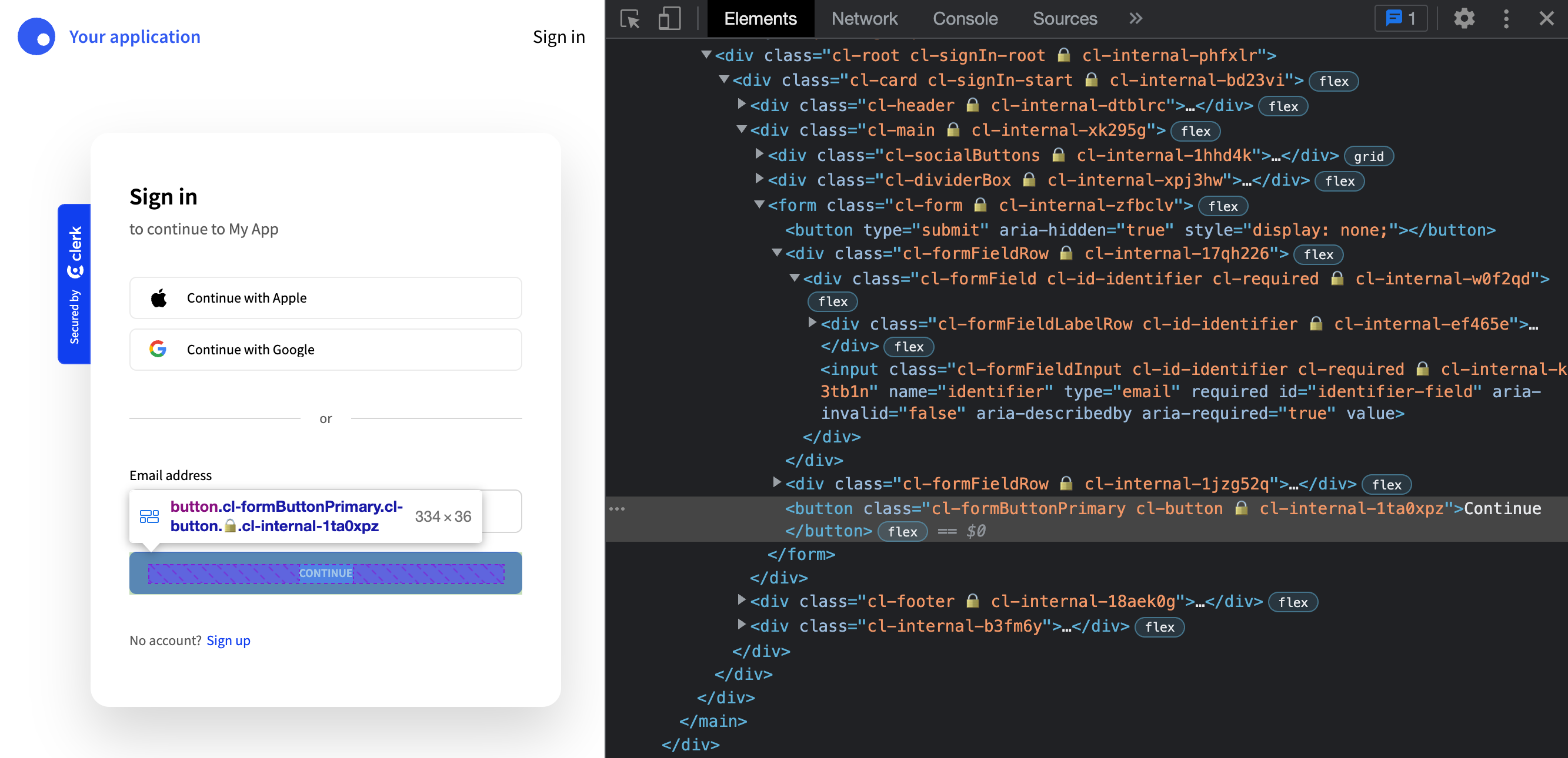
The element will have classes applied to it like:
cl-formButtonPrimary cl-button 🔒️ cl-internal-1ta0xpz
The classes to the right of the lock icon (🔒) are used internally and can be safely ignored. The main class to focus on for styling is cl-formButtonPrimary. Remove the cl- prefix and add the element property as a key in your elements config. The value will be the Tailwind utility classes you want applied.
1import { SignIn } from '@clerk/nextjs';23const SignInPage = () => (4<SignIn5appearance={{6elements: {7formButtonPrimary: 'bg-slate-500 hover:bg-slate-400 text-sm normal-case'8}9}}10/>11);1213export default SignInPage;14
Save your changes and you can see the Tailwind styles have been applied to the button:

